|


|
Writing by Type
by Justine Clark
The Wellington Writers Walk lifts typography off the page and expands it into the public
domain.
Wellington is not an
easy place to live in. The vertiginous landscape, cold southerly
winds, frequent rain and gusts that almost knock pedestrians
over combine to make an environment in which one must often work
hard simply to keep going. This difficulty is balanced by the
pleasures of the city itself, and of crisp, calm, clear days,
the bush-clad topography, the harbour and the rugged south coast.
The city demands both physical and intellectual engagement, and
the sheer difficulty of living here exacts a kind of determined
affection from the city’s inhabitants.
This hard-won, slightly
ironic affection is captured by a series of eleven large-scale
typographic works newly installed around the city’s waterfront – one
of its principal public spaces. These form the Wellington Writers
Walk, an initiative of the Wellington Branch of the New Zealand
Society of Authors. The society established the Writers Walk
to help make writing publicly visible and, in doing so, to celebrate
both the city and its authors. Each installation presents a quotation
from a significant New Zealand writer with strong connections
to the city, and most of these excerpts refer to the city in
some way. These are engaging and often wry responses to the city,
presented on large, thoughtfully situated concrete slabs.
The outcome is a fine
example of how a designer can, with determination and the support
of all involved, push a project well beyond the client’s
initial expectations. Where the instigators imagined a series
of small bronze plaques set in Civic Square, designer and typographer
Catherine Griffiths saw the opportunity for a much tougher, more
powerful approach, one that would use typographic design to complement
the strength of the writing. She proposed a series of large cast
concrete slabs that spill out of Civic Square, across the City
to Sea Bridge, and onto the waterfront. The completed project
is also an example of a highly successful collaboration.
Griffiths’ ideas
could not have been realised in this refined and resolved way
without the input of John Hardwick-Smith of Athfield Architects,
model-maker Dominic Taylor and Ron Seymour of Stresscrete, who
cast the concrete. Griffiths has used the project to explore
the possibilities of “public typography”
and to develop the potential of cast concrete as a medium for typographic
practice. The overt physicality of this material presents different
opportunities from the more usual media of ink on paper. The play
of light and shadow across a three-dimensional surface reveals
shifting qualities in the type, and thereby in the words. As sites
for shadow play, the panels also register changes in light quality,
in time of day and so on. But the material here is not just concrete – the
words and letterforms must also be understood as the matter from
which these works are made.
For Griffiths, the design
had to be worthy of the writers’ strong and beautiful words.
Her intimate knowledge of the particular characters of different
typefaces allowed her to select fonts according to an intuitive
response to the texts. The qualities of the selected fonts – Helvetica
Extra Compressed and Optima – work to reinforce the content
and sensibilities of the texts. The two typefaces are articulated
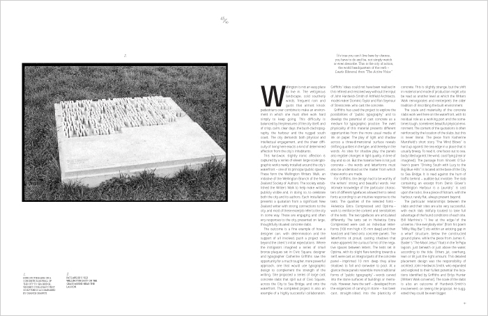
differently. The texts set in Helvetica Extra Compressed were
cast as individual letterforms [100 mm high x 35 mm deep] and
then hand-set and fixed onto concrete panels. The letterforms
sit proud, casting shadows that make apparent the curious forms
of the negative spaces between letters. The texts set in Optima,
with its slight flare tending towards a serif, were cast as integral
parts of the concrete panel – imprinted 10 mm deep they
allow shadows to fall and rainwater to pool. At a glance these
panels resemble more traditional forms of “public typography” – words
carved into the stone surfaces of buildings or memorials. However,
here the serif
– developed from the exigencies of carving in stone – has
been cast, straight-sided, into the plasticity of concrete. This
is slightly strange, but the shift in material and mode of production
might also be read as another level at which the Writers Walk reinvigorates
and reinterprets the older tradition of inscribing the built environment.
The scale and materiality
of the concrete slabs work well here on the waterfront, with
its residual role as a working port and the sometimes tough,
sometimes beautiful physical environment. The content of the
quotations is often reinforced by the location of the slabs,
but this is never literal. The piece from Katherine Mansfield’s
short story “The Wind Blows” is hard up against the
sea edge in a place that is usually breezy. To read it, one faces
out to sea, body tilted against the wind, coat flying [real or
imagined]. The passage from Vincent O’Sullivan’s
poem “Driving South with Lucy to the Big Blue Hills” is
located at the base of the City to Sea Bridge. It is read against
the hum of traffic behind –
audible but invisible. The slab containing an excerpt from Denis
Glover’s
“Wellington Harbour is a Laundry” is cast upon the
rocks, like a piece of flotsam, with the harbour, rarely flat,
always present beyond.
The particular relationships
between the slabs and their sites are also very successful, with
each slab skilfully located to take full advantage of the found
conditions of each site. Bill Manhire’s “I live at
the edge / of the universe, / like everybody else” [from
his poem “Milky Way Bar”] sits within an existing
gap in a wharf structure, below the constructed ground plane,
while the piece from James K. Baxter’s
“The Maori Jesus” floats in the Te Papa lagoon, just
beneath or just above the water, according to the tide. Others
jut, overhang, lean or tilt just the right amount. This detailed
placement design was the responsibility of architect John Hardwick-Smith,
who expanded and explored to their fullest potential the locations
identified by Griffiths and Eirlys Hunter [Writers Walk convenor].
The scale of the slabs is also an outcome of Hardwick-Smith’s
involvement: on seeing the proposal, he suggested they could be
even bigger.
The waterfront is one of Wellington’s key public spaces.
On a sunny day the city empties to stroll along the promenade that
stretches uninterrupted from the end of Oriental Bay to the working
wharves. In less benign weather the waterfront is still much used
as a route from inner suburbs to the inner city and the parliamentary
zone. This means that the works will be encountered in the course
of both leisurely promenades and brisk walks, in all kinds of weather.
Sometimes they will be lingered over, at other times they will
be glanced at quickly as a pedestrian strides past, head into the
wind.
The Writers Walk engages
this diverse public in a kind of interactivity that is both thoughtful
and active. These words require reflection. Having sought out
the slabs, or stumbled across them by accident, the viewer/reader
is invited to contemplate what this city is. The works are also
introducing an element of impromptu performance: as people speak
the words aloud to themselves and each other
– savouring the words, exploring the ideas – literature
comes to life on the waterfront.
Some of the quotations
appear readily accessible; others, like the excerpt from Baxter’s “The
Maori Jesus”, may benefit from local knowledge. For those
who want to know more, an equally well-designed booklet describes
the project, gives brief information about each of the writers
and provides a map of good bookshops in the city. Having engaged
with these writers in the public realm, the reader is invited
to pursue them privately.
This project also has
a bigger role to play in Wellington’s waterfront. It is
a highly contested space, the development of which has been marked
by endless skirmishes between the wellconnected, well-heeled
lobby group, Waterfront Watch, and the responsible authority,
Lambton Harbour Management. In the process, architects – many
of whom have struggled to improve the public spaces of the waterfront
for decades – have been conflated with “greedy”
developers, and Waterfront Watch has promoted simplistic schemes
against more sophisticated, evolving approaches to concept planning.
The Writers Walk installations have snuck onto the waterfront in
the midst of this debate and, perhaps unwittingly, they make an
important contribution to it. By demonstrating that design need
not be literal and that a lyrical but tough project can be a great
success, this work will, I hope, invite the broader public to begin
trusting designers again. Crossing between disciplines, this is
a small project that makes a significant contribution to the life
of the city.
Justine
Clark (at the time of writing) was editor of Architecture
Australia.
An architectural researcher, writer and historian, she has designed
and curated a number of architectural exhibitions, taught architectural
design, history and theory in New Zealand and Australia and has
been a visiting lecturer and critic at a range of Australian universities.
In 2000 she co-authored with Dr Paul Walker the book Looking
for the Local: Architecture and the New Zealand Modern (VUP, 2000). She is the brains behind Parlour: women, equity, architecture.
photographs
/ Bruce Connew © 2001
|
|
04 writing & critique
Walk With Me
by Stephen Cleland
curatorial essay, »Catherine Griffiths: Walk With Me«, Te Wai Ngutu Kākā Gallery, Aotearoa NZ, July 2025
Blood lines
by John Warwicker
exhibition review, »Catherine Griffiths: Out of Line«, Eye Blog, UK, June 2025
On the Expanded
by Megan Patty
curatorial essay, »Catherine Griffiths: Out of Line«, The Design Gallery, University of Melbourne, Australia, May 2025
The Shapes of Sound
by Ela Egidy
curatorial essay, »Catherine Griffiths: Out of Line«, The Design Gallery, University of Melbourne, Australia, May 2025
Read this space
by John L. Walters
book review, »catherine griffiths : SOLO IN [ ] SPACE«, Eye, UK, Spring 2023
Writing by
Types
by Justine Clark
Artichoke Magazine,
Australia, April 2003
related links
Wellington
Writers Walk
Making Noise
by Catherine Griffiths
contribution, Alphabettes Soup: 2015–2025, Bikini Books, Portugal, March 2026
Walk With: A Survey Exhibition by Catherine Griffiths
by Catharina van Bohemen
exhibition review, Art New Zealand #196, Aotearoa NZ, November 2025
A paper record
by Catherine Griffiths introduction, Present Tense : Wāhine Toi Aotearoa — a paper record., Aotearoa NZ, May 2023
An installation on an installation on an installation ...
by Catherine Griffiths
artist statement, »catherine griffiths : SOLO IN [ ] SPACE« A documentation, Pocca, China
September 2021
A Paper Vehicle
by Catherine Griffiths and
Bruce Connew
Dwelling in the Margins, Gloria Books, 2020
Figures that don’t add up
by Catherine Griffiths
Eye Blog, UK, March 2019
1997–2017, 43 Black Pins, 40 men, 3 women
by Catherine Griffiths
The Spinoff, Aotearoa NZ, August 2018
Power in the Poster
by Catherine Griffiths
Designers Speak (Up), Aotearoa NZ, August 2018
Peace
by Catherine Griffiths
Word—Form, Australia, 2018
Porto Design Summer School 2017
by Catherine Griffiths
review, looking back on the fifth edition, Portugal, April 2018
Notes from ‘Designing the perfect photobook’
notes from a short talk as part of a panel discussion, PhotobookNZ, Aotearoa NZ, March 2016
A meditation
Sir Ian Athfield, 1940 — 2015
by Catherine Griffiths
Architectural Centre, Aotearoa NZ,
April 2015
The Design Kids interview
interview with The Design Kids, Australia, July 2015
A Playlist : CG >> CG
by Catherine Griffiths
DPAG Late Breakfast Show, Aotearoa NZ, August 2014
Body, Mind, Somehow: The Text Art of Catherine Griffiths
by Gregory O’Brien
Art New Zealand #150, Aotearoa NZ, 2014
Nothing in Mind
by Chloe Geoghegan
typ gr ph c, Aotearoa NZ, August 2014
typ gr ph c in Strips Club
by Catherine Griffiths
Strips Club journal, Aotearoa NZ, March 2014
In the Neighbourhood
by Catherine Griffiths
Desktop #294, Australia, 2013
Interview
by Heath Killen
interview for Desktop #294, Australia, 2013
FF ThreeSix
by Catherine Griffiths
Typographica, March 2013
A note on the D-card
by Catherine Griffiths
Aotearoa NZ, April 2013
She’s Got Legs
by Lee Suckling
Urbis, Aotearoa NZ, January 2013
Truly, No Idea
by Catherine Griffiths
for Flash Forward, Desktop, Australia, November 2012
Look for the purple lining
by Catherine Griffiths
Eye Blog, UK, March 2012
Q&A TBI
interview with The Big Idea, Aotearoa NZ, June 2011
Shots in the air
by Catherine Griffiths
Eye Blog, UK, January 2011
John & Eye
by Catherine Griffiths
ProDesign 110, Aotearoa NZ, January 2011
Quite a Blast
by Catherine Griffiths
ProDesign, Aotearoa NZ, January 2011
Inner-City Modality
by Mercedes Vicente
ProDesign, Aotearoa NZ, August 2010
Beautiful World of Typography
by Catherine Griffiths
excerpt from a talk, Govett-Brewster Gallery, Aotearoa NZ, June 2009
For the record
by Catherine Griffiths
Introduction to For the record, TypeSHED11 11–15/2009, Aotearoa NZ, February 2009
Locating Our Feet
by Catherine Griffiths
Threaded, Aotearoa NZ, October 2008
Notes
on Feijoa
by Catherine Griffiths
ProDesign, Aotearoa NZ, April 2007
Life in Italics
by Helen Walters
Print, New York,
USA, September-October 2006
Writing by
Types
by Justine Clark
Artichoke, Australia, April 2003
|