|
A few of the logotype variations; and the Parlour Asterisk
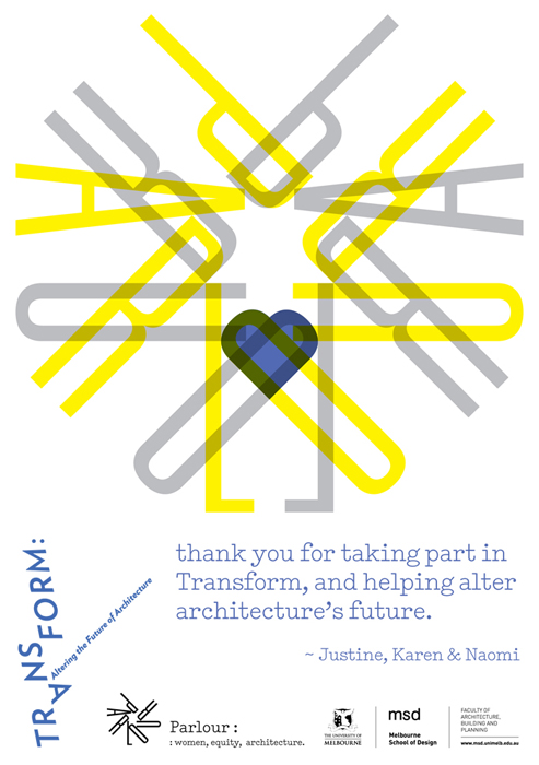
The Parlour T-shirt, as drawn by Lily © 2012 The Parlour blog: built by Peter Johns, Butterpaper, Melbourne Parlour Thank You card, for the Transform conference 2013
|
05 a corporate world selected exhibition: A bespoke display system for New Zealand Institute of Architects exhibition: ParlourLIVE! film: Making Waves with 20... id: Athfield Architects online: Interstices Journal print: A+W•NZprint: BRAIN magazine, JP print: Desktop magazine, AU print: Adam Art Gallery print: Kristy Gorman print: Creative New Zealand print: TypeSHED11 print: RAMIREZ/LAINUS poster: A+W•NZ wayfinding: Athfield Architect
Logo for Parlour: women, equity, architecture. client: Parlour: women, equity, architecture. Australia Asked by Justine Clark and Naomi Stead to design a logo for a new community-based resource (part of a wider research project, Equity and Diversity: Women, Leadership and the Architecture Profession), we (JC, NS and I) set to work with FLO, derived from the name of Australia’s first registered woman architect, but this quickly changed when it was realised some of what she stood for was unfitting! By fate we were led to PARLOUR: “a space to speak — bringing together research, informed opinion and resources; generating debate and discussion; expanding the spaces for women in Australian architecture”. The typographic composition of the PARLOUR ‘asterisk’ ireferences the architectural voice of women (parlour / parler) in a discipline where fine minds and skills are honed to converge/diverge, make marks, make change towards a new movement. The strapline, together with punctuation, is set matter-of-factly: stating the point. The logotype is composed in the finest weight of Univers: 39 Thin Ultra Condensed, designed by Adrian Frutiger in 1954. The strapline : women, equity, architecture. is set in Typewriter, A2-Type, London, and released in 2011. Typewriter and other members of the Univers family are used throughout the website, built by butterpaper.com — a practice run by architect and web designer Peter Johns. related links critique: Writing by Types, by Justine Clark www.archiparlour.org Equity and Diversity: Women, Leadership and the Architecture Profession
2000s selected Athfield ArchitectsREANNZ Research & Education Advanced Network New Zealand The Oxygen Group 1990s selected/archived Creative New Zealand |
||||||||||


